Adobe
Duration
4 Months, Fall 2019
Project Type
Client Based Project
Team
You Jin Lee, Jago Pang, Jessica Chou, Noe Abe
Description
We were given a project where we help to design a short-form video editing app that is made for the Chinese market. Adobe’s vision for this project is to empower and encourage more young consumers in China to participate in the video content scene, enabling them to create the content they have in mind.
My Role
As our team worked on the whole 4 sprints which are User Research, Ideation, and Prototyping. I was given a chance to lead in the process of Ideation. I was able to lead the overall ideating process, and affinity mapping, where our team came up with innovative ideas to think about what is the next big thing.
Final Product
User Research
We started off our project with user research. We used 4 different methods, and decided to focus on:
Methods
Interview
We were able to interview 6 people among age between 18-35. We learned about the users habits, and motivations in details. We conducted usability testing with existing apps.
Ethnography
We were able to talk to 7 people with the short interview questions we made to find users' motivations, to see example videos that they have made, and to observe their editing process.
Secondary Research
We found today's trends, example of native app/WeChat's mini-app, existing sharing platforms, and existing editing platforms
Survey
We sent out survey questions to various Facebook Chinese-associated groups, Reddit, and Wechat. We have received 75 responses.
Affinity Mapping
Key Insights
User Persona
Personal Diary
Motivation
keep a diary of life
keep videos to watch later
spontaneous video creation
Needs
wants to look back on memories
create videos quickly
does not care about popularity
Frustrations
Overwhelmed when too many features
Lengthy video editing process
High learning curve for content creation
Features
diary formatting
narration/text on video
location/time tagging
immersive filters
quick live capture
Personal Fun
Motivation
recreate trends
discover new editing features
join friends in making and editing videos
Needs
easy editing and sharing videos
awareness of trends
Frustrations
Long editing process
Lack of confidence to post content
sharing platforms not uniform
lack of native audio import
Features
Exploring videos
Appealing beauty filters
Speed/motion features
Templates/tutorials
Music features
Influencer
Motivation
entertain viewers
encourage/connect with others to have fun
publicity, income
Needs
innovative ideas
keep track of trends
professional editing for quality videos
Frustrations
Editing spread across several apps
Standing out in the creator space
Features
Animation, audio and clipping edits
advanced sharing
storyboarding
Ideation
I have led in in this ideation process. At Adobe Office at San Francisco, we started to ideate our ideas and coming up with the potential features with the method of Crazy 8s method with our clients. We ideated toward each user persona based on their needs, wants, and motivation.
Prototype
We first prototyped the basic screens that we would need for our application. We chose these screens, and features based on the needs of all user personas.
However, because the needs among user groups were diverse, we decided to make both a default view, and an advanced view as it would be difficult to integrate all the features for all user groups. As we were sketching, we have thought of different sequences of action:
How would an influencer edit their videos?
How would a personal fun user find videos?
How would a diary user record their videos?
User Flow
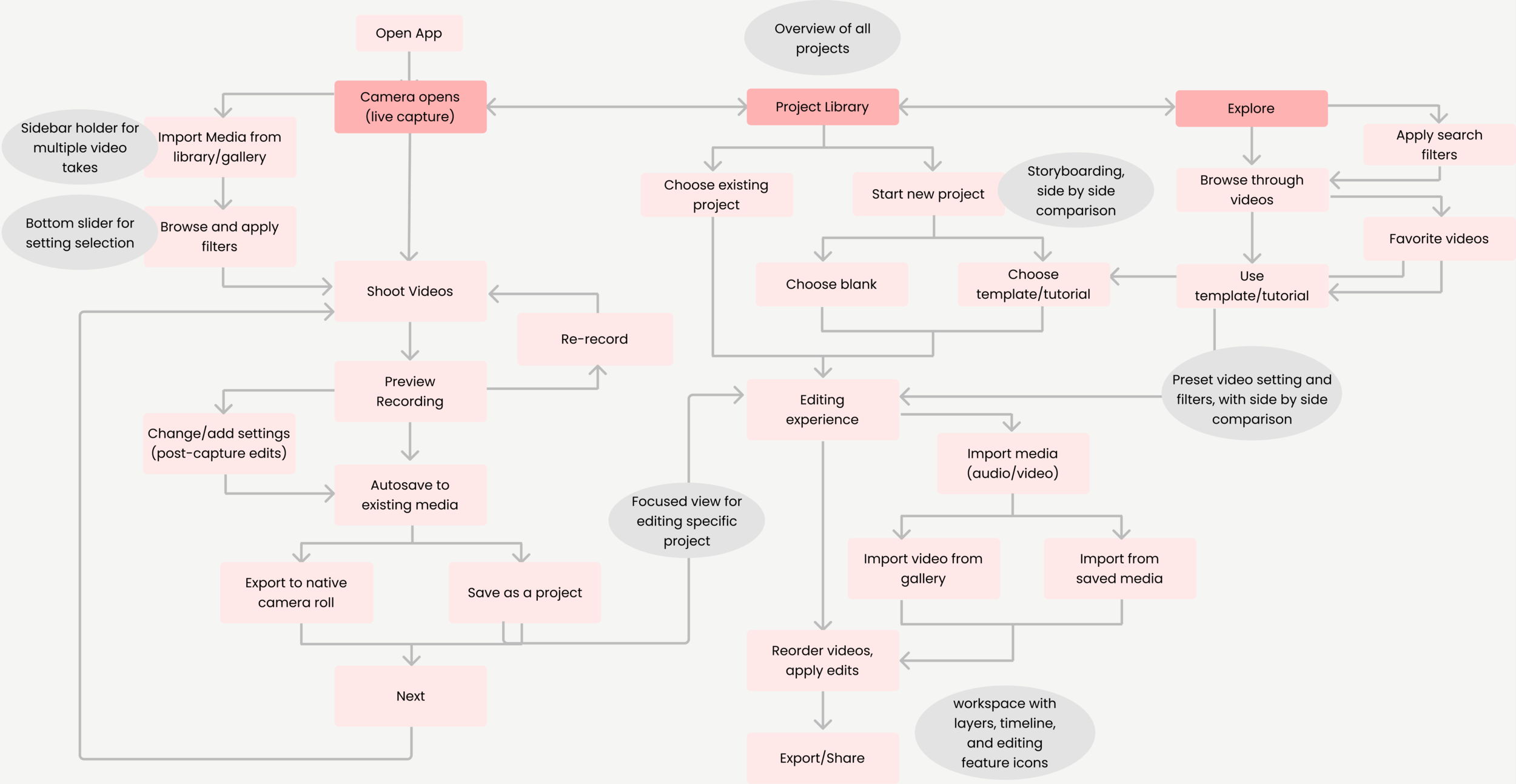
General User Flow
As we have sketched both modes, we had to organize the general flow to discover any missing pieces to our sketches.
Developed User Flow
From general user flow, we consolidated features, and potential UI patterns to developed user flow. Additionally, we considered how different user groups would enter the app, such as:
Would there be a tab to switch between editing modes?
Can users tweak the settings they see on the screen?
Redefining Our Scope
Noticing the large scale of our project compared to our given time, we decided to prioritize designing mainly for Personal Fun. We chose this user persona based on the greater quantity, and needs that mostly fills in both Personal Diary, and Influencer. Our new focus was:
How might we create a short-form video app that encourages users to have personal fun in their editing experiences?
Moon Shot Ideas
Based on the research, Personal Fun Users focused heavily on exploring videos, trying new features, and recreating a trend. Therefore, we thought outside of the box, creating features that have never been made, or features that already exit, but better. Our client encouraged us to think about what could be the next big thing.
Here are the ideas that were made, and the bolded ones are the ideas that were generated to mid-fidelity prototype:
Music Maker
Face in Hole
Custom transitions
Interactive filters (micro-animations, live painting, AR)
Collaborative capture (live)
Fashion/e-commerce links embedded
Environmental filters
Auto-editing
Collaborative editing
Captions/subtiles
Collaging
Screen recording
Interactive/engagement filter
Custom split screen
Video hopping/animation
Automatic stabilization
Automatic speed adjustments
Mid-Fidelity Prototype
Considering the basic screens that we created during our low-fidelity prototyping, we have integrated the features into the screens that would make the feature work the best.
High-Fidelity Prototype
With the UI color schemes that Adobe uses, we created our UI library
with our UI color scheme, we have have created our hi-fis. When creating, we were considering all the icons, and features that Adobe already had, and added them.
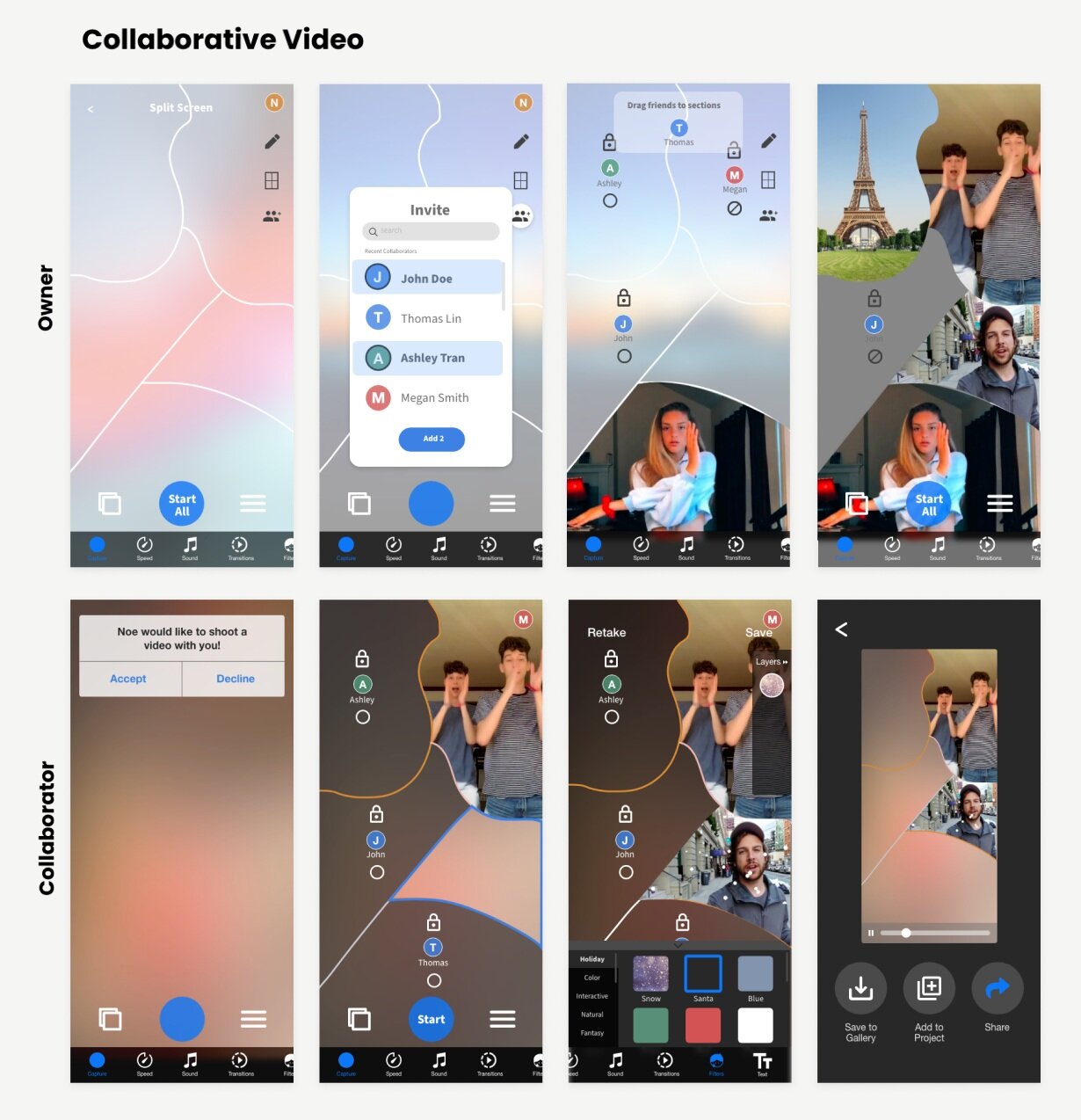
Create your own custom split-screen video. Invite friends to join, and assign each of them to a section of the video. Toggle collaborators on or off, and lock them in place.
Be a part of a friend’s video. Edit with fun filters and AR features. Each added feature will appear in the layers tab on the right.
Select the background to mask with a new environment or choose a location from Google Earth. Prerecorded videos will appear for you to choose from.
Mask a moving object and turn it into a sticker. Apply it on top of another video.
Additional Features
These are the mid-fidelity prototypes that we were not able to develop into hi-fidelity prototype due to limited time.
Basic Screens
Moonshots
A live capture mode that allows users to film multiple takes of one shot one after another, and then review them quickly to determine the best one to keep.
This feature allows users to “draw” their own transition between clips by indicating the motion and speed of the desired transition through their drawing.
This feature allows users to pin clothing items or other commercial items that appear in their video with a description or url tag that stays on the item throughout the video.


